Creating a Universal Design System for Web, Mobile, Wearables, and XR
This is a write up of a talk given at the 2019 CAA International archaeology conference in Krakow, Poland. See the slides.
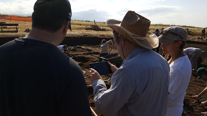
Over the last five years, we’ve been working on cross-platform web, mobile, and AR/VR apps for several excavations as term partners.
Some of our original goals starting out with this were:
- To display archaeological data directly where it was discovered, and
- To create an interface that can be used to construct site or object narratives equally to empowering researchers to interrogate collections.

We hope to empower expert users with advanced search tools and live access to geodatabases and shapefiles while also enabling curators and students to construct guided tours of their data for the general public.
The most significant challenge of all this was creating a design system to provide a cohesive experience across mobile, tablet, desktop, AR and VR platforms.
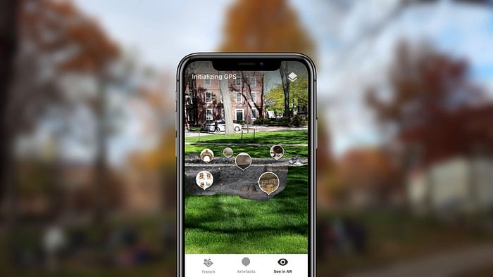
In a nutshell, design systems are an extension of systems thinking. Whether you’re aware of it or not, you interact with products derived from systems thinking every day.
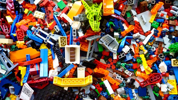
LEGO pieces are an example of systematic design. You have many LEGO pieces, but every piece follows a certain standard in order for it to plug ’n play with other pieces. This creates a consistent experience. When a new LEGO set comes out, consumers already know the ground rules to use it.

Another example is IKEA. Each piece conveys a certain IKEA aesthetic, and even when some furniture is more unique, it is often assembled using the same standard IKEA screws and parts. This reduces cost for IKEA because those parts can be mass produced and reused.

Apple’s products all have a similar feel to them. If you have an iPhone, pick up an Apple Watch, and you’re already half familiar with how it works, even if you’ve never used it before. You spend less time learning, and more time enjoying and exploring. And that’s exactly what we want for our users.
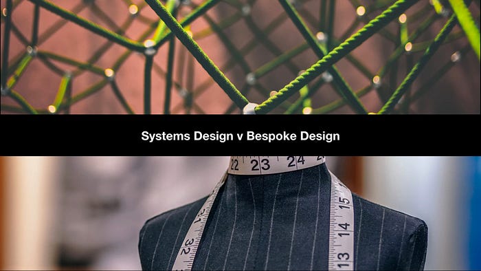
On the opposite end of the spectrum is bespoke design. That is, handcrafted single-use designs for single use cases.
There’s nothing wrong with bespoke design if one has the time and money for it. But it’s usually more costly, especially as a product grows. Imagine how much your average iPhone would cost if Apple assigned one of their designers to design one specifically for you. And how long such a phone would take to build. Having your own bespoke smart phone designer seems ludicrous, right?
Yet, in a way, this is how most digital products are made these days. From websites, to mobile and VR apps. And, this cost and inefficiency makes building these digital products costly, and therefore more difficult to secure funding for. Especially projects on tight budgets could really benefit from systems design thinking.
The point of creating a design system is to design at scale to build high-quality, cohesive products, across all digital platforms — and fast.
Here’s the design system that we use on our flagship product, Orpheus.

Our flagship product, Orpheus, is built using a design system that created specifically for it.
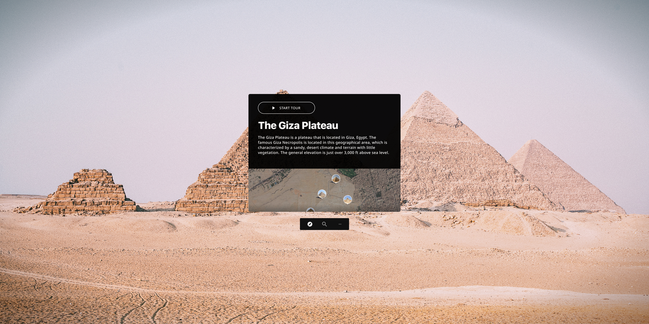
The idea for this design here is that you, as a user, can explore a Google Street view style 360° experience of the Giza plateau in Egypt.
The idea is that you’ll be able to do this on a virtual reality device, on laptop, mobile, and smart watch. The UI shares common colours, typography, icons, and a family of common UI components like the play button, and the map view.
So let’s look at this in detail. First, the virtual reality experience.
Imagine you have a virtual reality headset strapped to your head, and a controller in hand, and you go to explore the Giza plateau in virtual reality, and you see the view above.
Zooming in on the UI here…
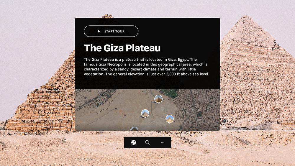
Here, you can select “Start Tour” to explore the space around you, and to hear an audio narration as you explore the space.

This triggers the tour to start.
The audio narration starts as well and you can look around and explore the space. Zooming in on the UI again…

…these little pins let you teleport yourself to tour spots in virtual reality. Now, I won’t go into detail here about how this app will actually work, but just notice how this virtual reality experience, feels similar to the laptop experience, below.
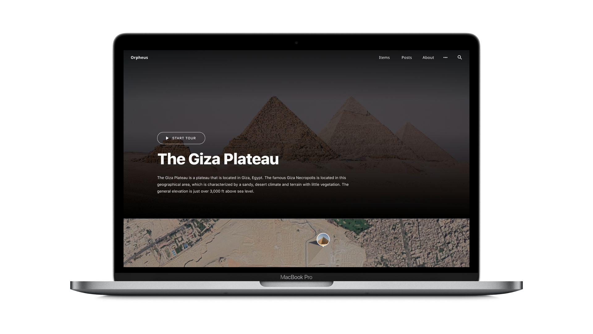
A slightly different layout, adjusted to suit the laptop experience. But, the core features are the same. So, you click the “Start Tour” button and…

… the tour starts. Again, same colours, typography, and the same UI components, though we do tweak them a bit to adapt to the device. Next, you’ll notice how the sidebar — that’s shown on the right here — is reused on mobile, where it’s location is at the bottom of the display.

On mobile, the sidebar information and UI has moved to the bottom of the viewport, to make best use of the limitations of the mobile display. But they are all still the same components, same icons and typography, the same features, and the same consistent user experience.
Next, the smart watch UI, where there is a lot less room.

The same controls are utilised, and the content is out of view. And the emphasis here is on the audio guided tour, which makes for the best experience on the smart watch.
So, again, all the same features, the same UI components, just adjusted to fit each type of device.

Here’s the recipe we used to create the design system you just saw.
Step 1: Don’t reinvent the wheel
I can’t stress this highly enough. Unless your project has a six figure budget, do yourself a favour, and pick a ready-made design system and customise it to match your brand.

To make things easy, Google has created a ready-made design system that everyone can use and it doesn’t cost anything. It’s called Material Design and you can think of it as a big bucket full of UI Lego blocks that you can use to quickly assemble your digital product.
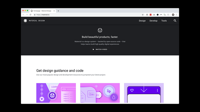
Material Design comes with: a colour system, a typographic system, animations, buttons, forms, selection controls, navigation, sliders, tabs, you name it.
All you have to do is customise it a bit with your own colours and typography, and you’re good to go.
Step 2: Customise Material Design
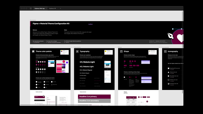
Material Design starter packs are available for common design programs like Sketch and Figma. We use Figma, and below you can see how we customised material design using a free-to-use template.

First, we pick the colour scheme.

Then the fonts.

And we get a nice overview of the theme.
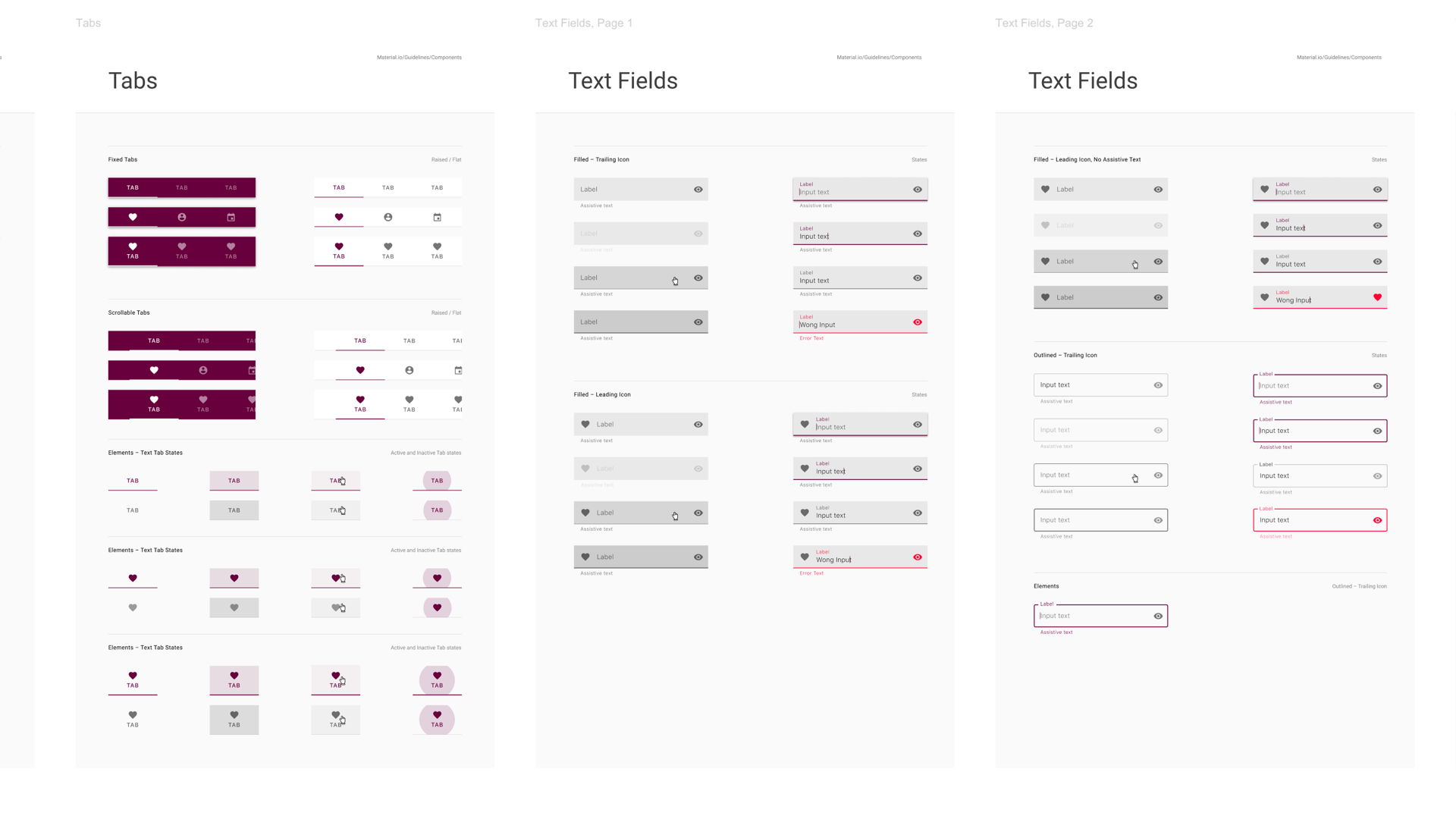
And a whole lot of components, all themed to match our colours and typography.

And a whole suite of icons, as well.
Step 3: Build upon it
Material Design gives us a solid foundation, but not nearly enough in most cases to design a whole product with it alone. You still need to build upon it, but Material Design is a solid foundation. So, at Archimedes Digital about 30% of our design system is powered by Material Design. The remaining 70% comes from our own creations.

So again looking back to the design shown earlier, the typography, and colours are powered by Material Design. Everything else is our own addition on top of that design system.
So, the design of the header and the header navigation, the big hero section at the top and the map view below, all that is our own creation on top of Material Design.
Tips

I cannot stress this enough. Default to simplicity and consistency. These are your friends.
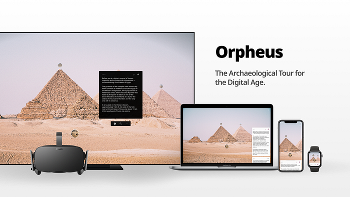
Looking at our vision for Orpheus here, we’re hoping that when a user moves from one type of device to another, that they’ll be able to quickly learn how to use Orpheus on the new device. And, because of this consistency we can write less and that saves a lot of development time as well.

You want to have one place where your design system lives. If it’s scattered across mockups, emails, Slack messages, code, sketches on paper — then it’s all over the place, and you then don’t really have a design system, at all.
So for us, the design system is born in a design tool — Figma. Then from Figma it moves to Miro, which is sort of a whiteboard in the cloud. Here we document it and discuss it. This is where I lay out all the features and screens that our product will have. And this is where designers, developers, our clients open when we collaborate early on.

But these are just architectural sketches, a temporary holding place for our design system vision until we build it out in code. It’s an important deliverable that help us along the journey to creating our design system. But ultimately it’s just a throwaway deliverable. Because our design system doesn’t live in Figma or in Miro.

Our design system is baked right into the code itself. It’s a living, breathing design system, and it evolves as the codebase itself evolves.
In case you’re curious, we use React to power our codebase, and a neat little React library called Storybook to help us do so. It’s open to the public for anyone to view on storybook.orphe.us.
Okay, so this is cool, but how does this help you regarding the creation of your own digital products?

If you start a product by utilising a ready-made design systems instead of bespoke handcrafting it from scratch, you’ll be far more efficient. This efficiency will be a factor — albeit not the only factor — but an important factor in being able to secure funding for your work.
Basically, utilising a design system like Material Design allows you to hit the ground running. And this helps no matter what you’re working on, but especially those with tight budgets, as is often the case in our field.
10 minutes is only enough to scratch the surface of using design systems. There’s plenty more about this on our blog, where we also talk about how we prototype virtual reality experiences, examples of how we run remote design sprints, and how we use design thinking to help test the waters for product ideas.
We’re also on Twitter: @archimedigital.
Recommended reading
I recommend checking out the following reading material if you want to create your own design system. The designbetter.co blog posts are a particularly valuable resource.
Polaris from Shopify is a great example of a great design system in action.
Storybook is a React library that makes building UI libraries a breeze (if your code is already built on React).
If you have experimented with design systems yourself, please come to us and tell us your story. We’d love to hear and learn from others who tackled similar problems.
Thank you for reading.
