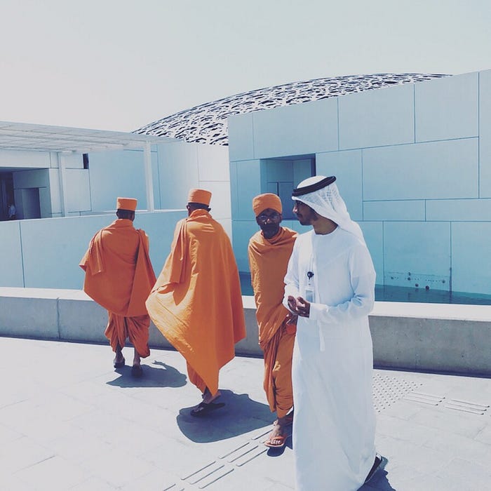
A Designer’s Take on Louvre Museum in Abu Dhabi
When visiting a museum I’m often focused on the museum experience itself, rather than just what’s on offer. Here are my observations from a visit to a beacon of cultural heritage in the Middle East.
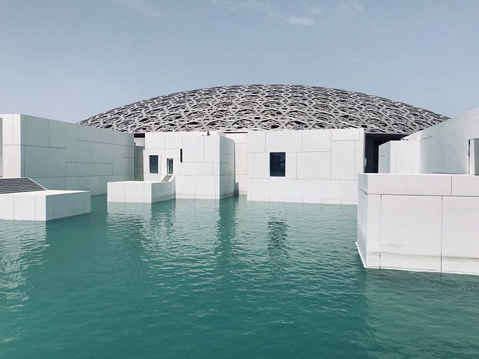
Anticipation builds even before entering the museum.
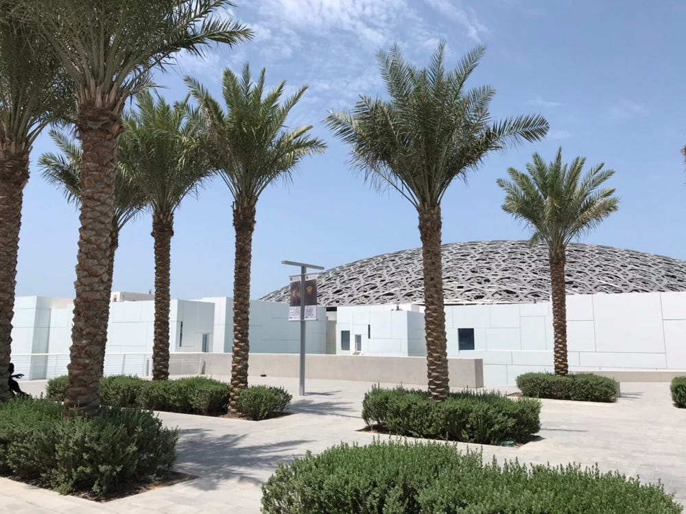
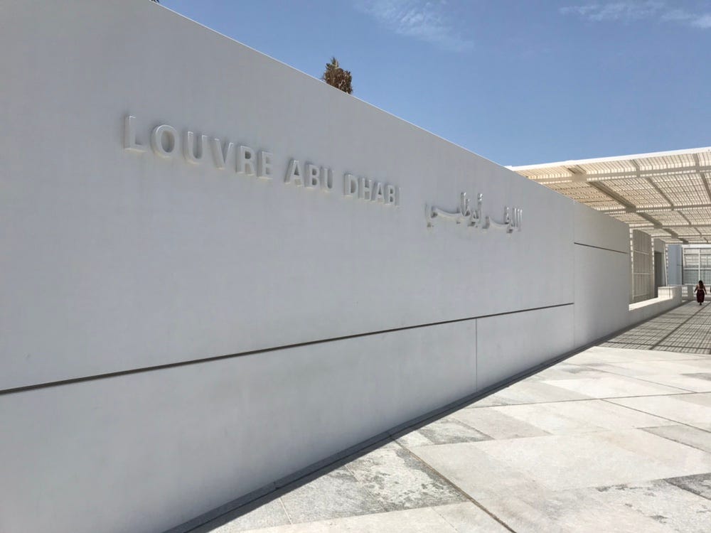
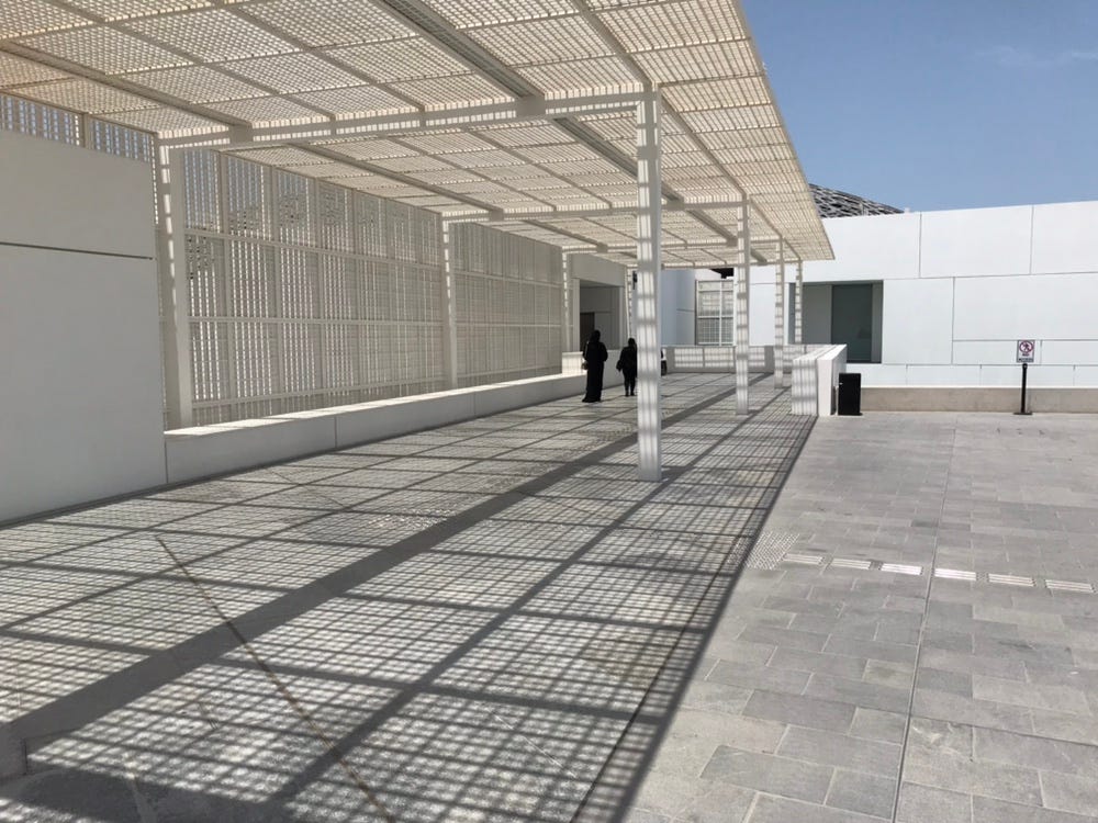
The minimalist style of the architecture, expansive blue sky above and the Abu Dhabi sun really drive home the feeling that one is in the Middle East.
On entering the building, tickets can be purchased at the ticket booths and at the main service desk. The self service booths were simple enough to figure out.
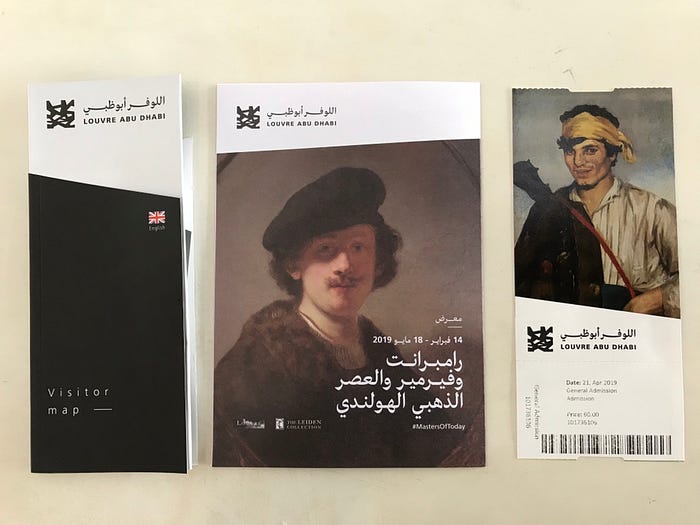
The welcome pack of map brochure and ticket.
Someone should go all “Steve Jobs’ iPhone 1 presentation” on these and combine them all into one. Or even better, let the smart phones take care of it.
Moving on, I chose to skip buying the extra audio tour headsets because on Google Maps I read that the museum has created a free app. Plus, I’m a bit of a germophobe and don’t like the idea of wearing a communal headset.
One of the first things I tried to do was to download the app. There was no info anywhere regarding the Wifi code — that’s a minus. But one of the friendly museum staff was happy to help – a plus.
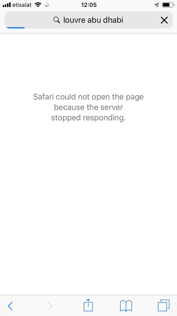
Then I managed to connect but the internet didn’t work. Definitely a minus.
Wifiless I persevered.
The main space is beautiful. The whole concept hinges on the idea of “universal”. A well choreographed display, highlighting similarities across cultures and religions, but also celebrating the distinct and unique.
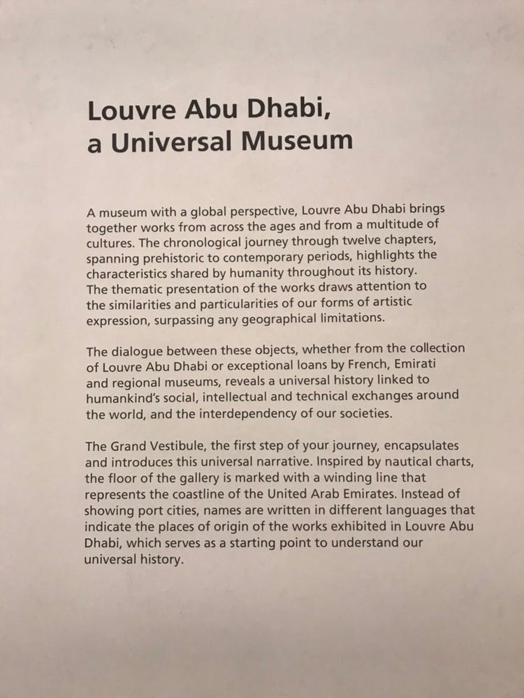
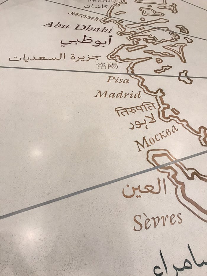
The combination of the universal theme along with a cartographic visual showpiece really resonated with the Sid Meier’s Civilization geek in me.
Reading some of the information plaques proved difficult, however.
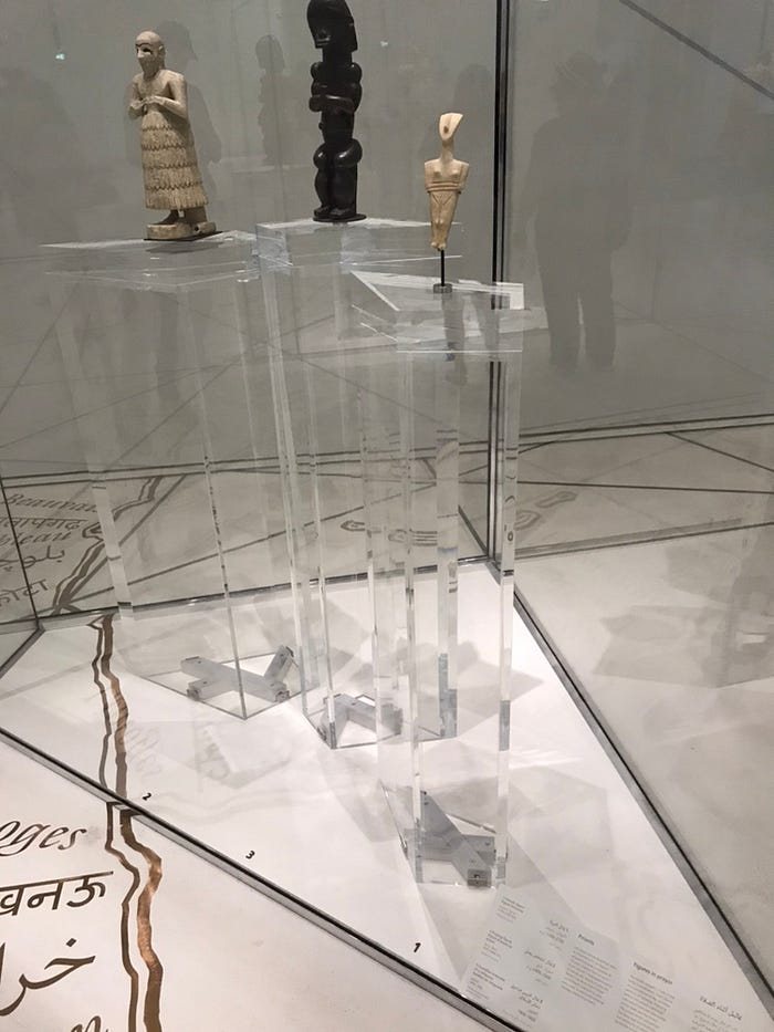
Lucky I have decent vision, but even so I had to do a fair bit of squinting.
Wish I had that app.
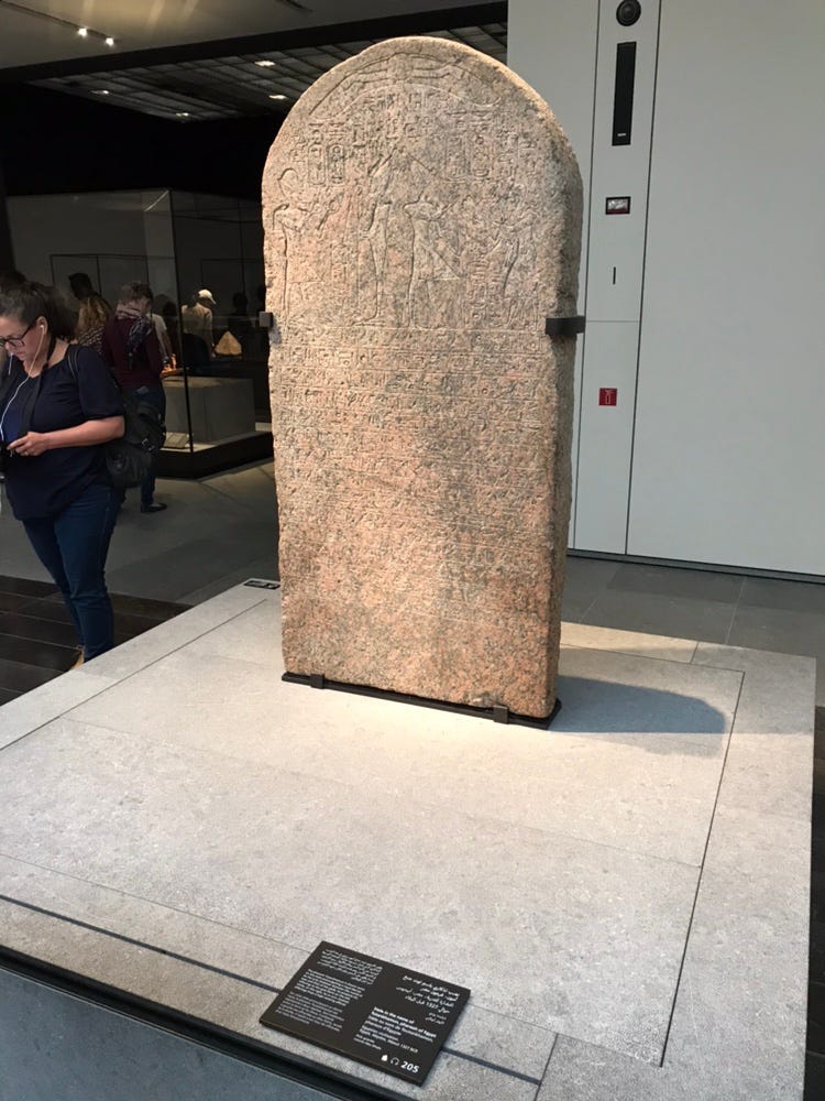
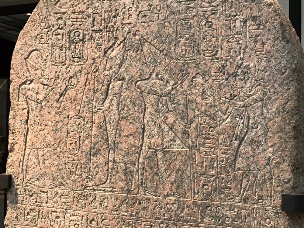
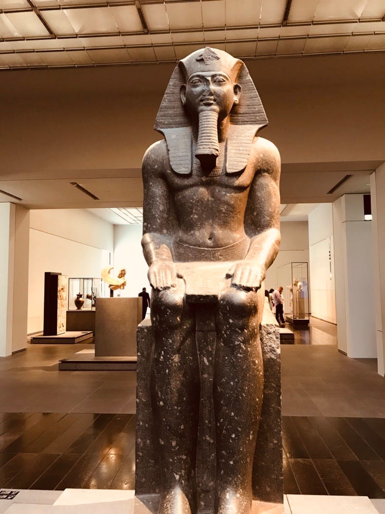
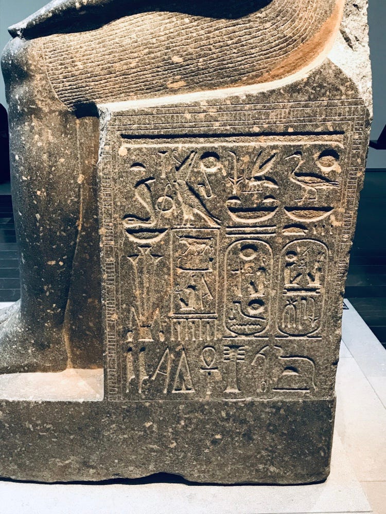
If only I could use an AR app to point at these hieroglyphs to tell me what they mean.
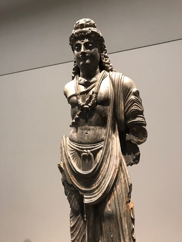
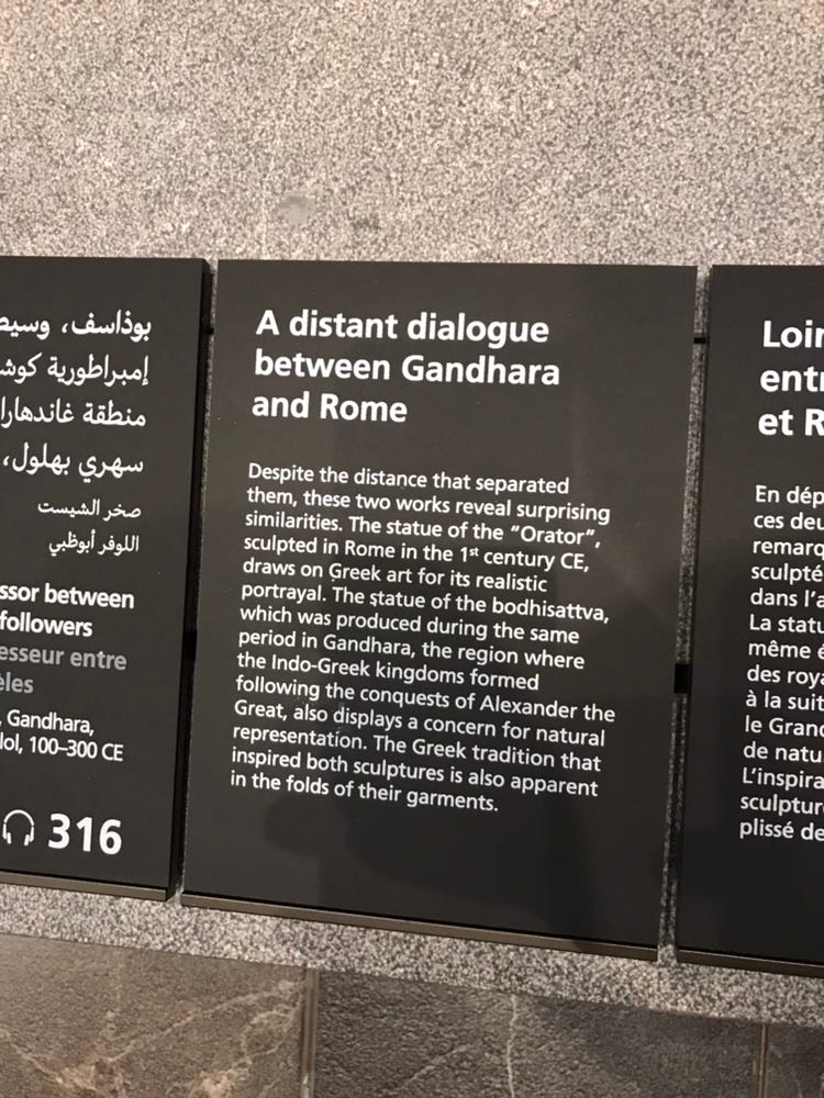
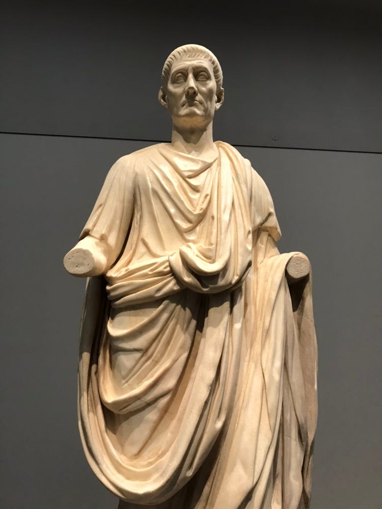
Particularly interesting – and in line with the universal theme – are the way the museum connects similarities between cultural works across time and location.
I predict that in the next few years an app will be made or bought by Google, allowing you to point your phone camera at different art pieces and see related objects. And that with such an app, machine learning will be used to reveal unknown similarities between art around the world.
Moving on, one important detail I learned about on the day was the following date notation:
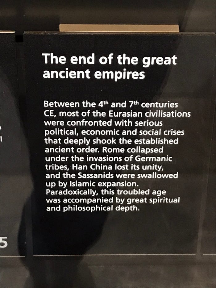
Being accustomed to seeing BC and AD, I was a bit uncertain about the “CE” in the text above.
Turns out the common era is a universal notation for dates. One that still utilises the Gregorian calendar, but makes it more friendly to non-Christians by using BCE – before common era, and CE – common era. A standard that I now hope to see become mainstream everywhere under the banner of inclusiveness.

The above was a space between the galleries. Whenever I see such displays being used I can’t help but feel “surely this space could be used better”.
Nothing wrong with having a break from constantly analysing and taking in cultural information. In fact, this is a positive. One shouldn’t be “in their head” the whole time there.
I find many cultural institutions engaging in such high-tech ways of segueing from one gallery to the next. Yet something about it just says “let’s put up some LCDs with pictures of the artwork”.
There were also displays featuring animations.
Definite wow factor.
Informative? Not really. I never quite know whether I’m witnessing the start or end of a video when I see these, and I’m not sure if it really matters.
Either way, it takes 2–3 loops of the animation and me paying careful attention in order to fully digest the information.
Then, I also need to “sync” that with the printed information on the wall. Lots of work if I want to consume the info properly.
The “portion size” of the information here was perfect. Usually 20–40 seconds for a loop.
Touch screen displays are also utilised, allowing visitors to interact and go at their own pace. But I found the UI here really awkward.
I didn’t think a two-button UI could be cryptic but there you go!
Looks like I wasn’t the only one struggling to decipher how to use it.
And that brings up a really important point.
Digital experiences at museums are often plagued with bad design, and even when they are good, they’re all bespoke.
And while bespoke is charming and adds character, bespoke is a problem.
I’m not bashing on the people designing digital experiences at museums. Being a digital designer in the humanities space myself, I know it ain’t exactly easy.
But what the consumer needs here isn’t a great app designed by the Louvre Abu Dhabi organisation. What we need is an “Uber for museums”.
I expect cultural institutions to be averse to this idea. It would mean jumping on top of a platform, and being dependent on it. At least to some extent.
But they already do this. They use Twitter, Instagram, Facebook etc. for social media. Anyway, I could write a whole post around this topic. Better keep moving.
And then I get a notification on my phone. The Wifi started working. Glorious Wifi.
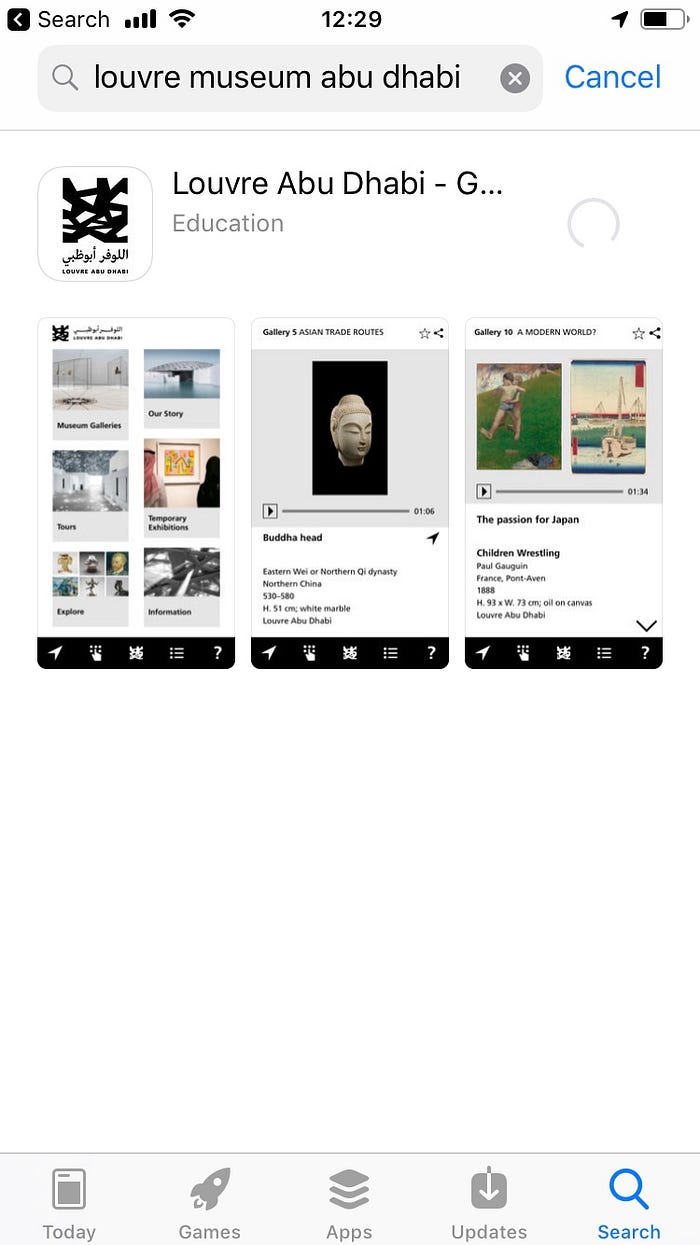
And off we go!

Again, really digging the minimalist visual aesthetic.
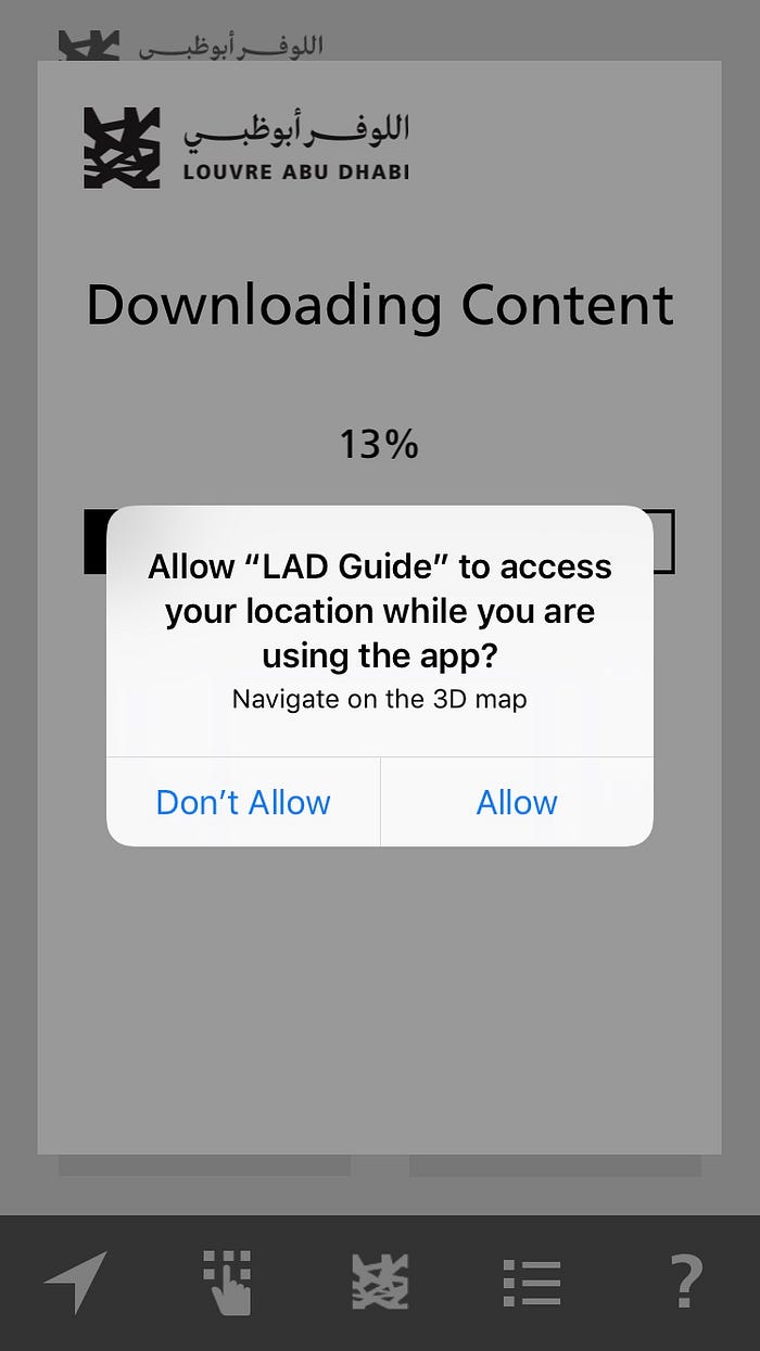
Not exactly the softest of permission onboarding experiences. And the “Navigate on 3D map” text explaining why the permission is being requested is really weak microcopy.

I was initially surprised that the app didn’t come with the content already “baked in”. But in designing similar apps myself, I fully understand why this is necessary.
The content is dynamic. Curators may want to update it like they would a WordPress site. For an app covering many different museums this would make total sense.
But for a single use case app, it was a bit of a surprise.
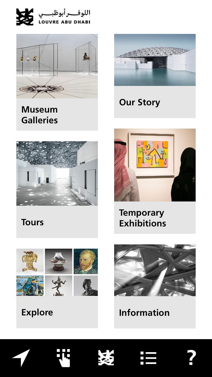
Alright, I’m in!
Those icons in the bottom navigation bar sure look cryptic though. Wish the app stuck to iOS / Android design guidelines here.
I tapped around a bit to get my mental model in sync with the sitemap of the app.
Okay, app! Audio tours! Time to shine…
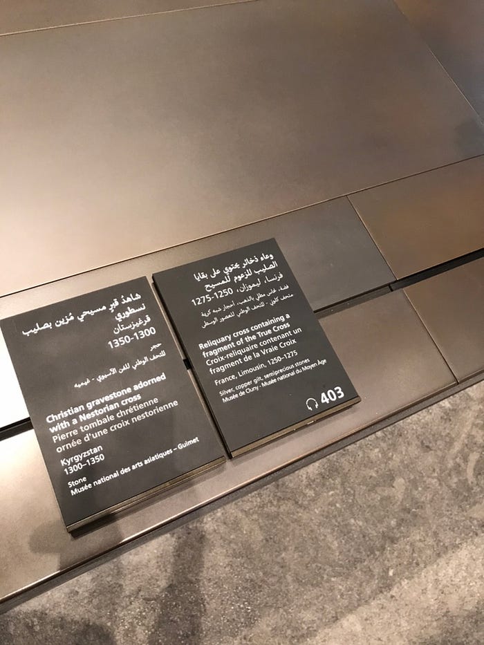
Many of the pieces on display had audio tour codes printed on the information plaquettes.
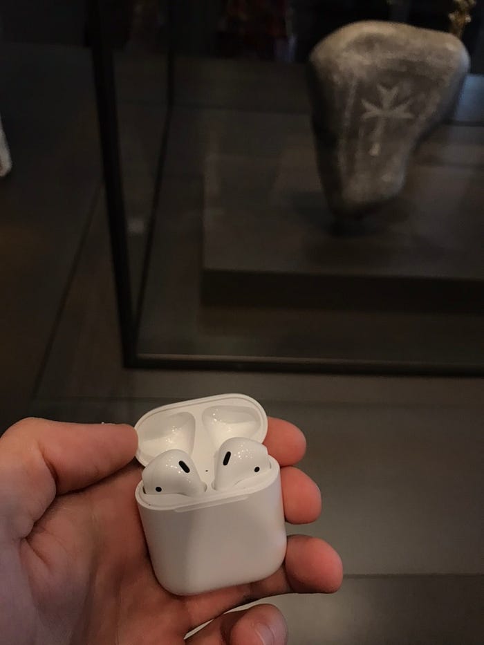
I was looking forward to this ever since I got my shiny new AirPods. Audio tours with the comfort of my own phone, all without any awkward wires. Nice.
And like I hoped, the experience delivered!
For the most part. There were some bugs and app crashes later on, but when it worked, it was a real value-adding experience.
I particularly liked the subtle touches in the audio experience. In some of the items, there was a contextual background, like a Christian choir, that one can hear. It wasn’t overdone and the voiceover fades in quickly. Just enough to set the mood. Perfect!
The content of the voiceover was educational and interesting, and most importantly the portion size was just right at about 45 – 75 seconds.
The interactive map above was rather awkward to use. Very buggy and ironically, disorienting.
A nice touch were the little animated water waves around the map, representing the water surrounding the museum. Small details like these are an advantage for bespoke apps.
The typography and colours that match the brand of the museum, those little waves. It all adds up.
But my bet is still on Google and co. Even if the app wasn’t buggy I can’t imagine any bespoke experience being better than a “take me everywhere” app. One I can learn once, then take with to every museum I go to. It’s the same reason why Uber and Airbnb are so popular. No matter where you go, the experience is consistent. There’s no need to download taxi apps as I travel anymore.
You spend less time downloading new apps and learning how to use them, and more time doing the thing you wanted to do in the first place.
Museums today find themselves in a very similar situation to taxi companies or record labels years ago. They have a monopoly over the content, they’re slow to innovate and they aren’t user-centred. And even when they are, they don’t think globally.
This is not to criticise the Louvre Abu Dhabi app at all. In fact, this app might be the best museum app that I’ve personally used.
Which is exactly why it brings to light these systematic flaws in all museum apps.
Unlike taxi companies and record labels, an Uber/Airbnb/Google level quality museum disruption app might be the best thing to happen for museums in years!
If anything, it’ll take the “digital burden” off their shoulders and allow them to focus exclusively on their area of expertise.
A mix of “wow” and “how do I use this thing?” again.
Kudos to the visual and brand consistency between print, app, and digital displays at Louvre Abu Dhabi.
However, they could really make use of a design system here to create greater consistency. It feels like every UI is a custom solution on its own. Like each piece of UI was designed in isolation without thinking about the holistic experience.
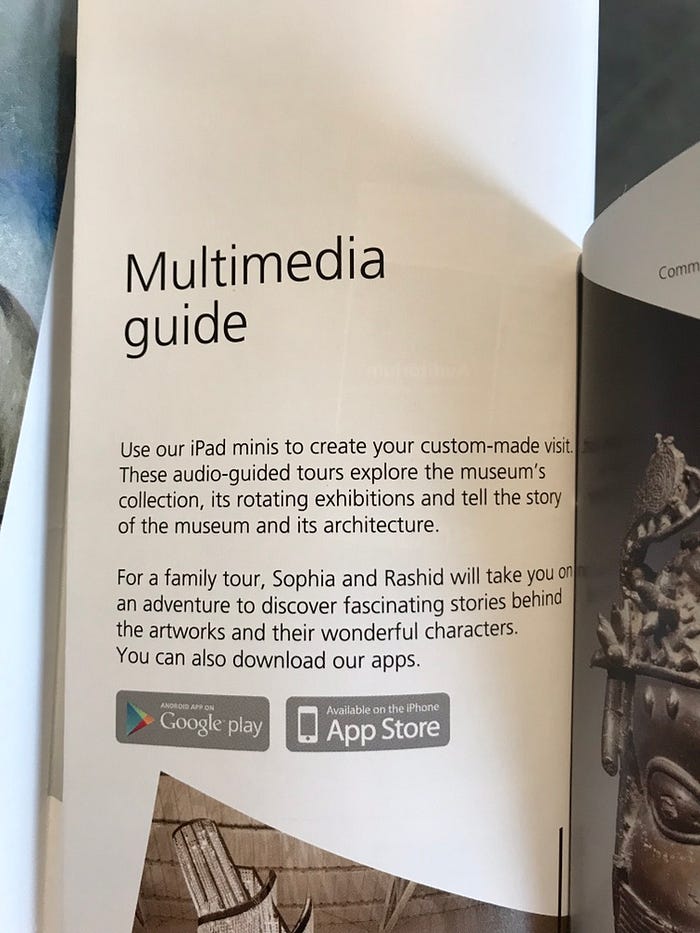
Looking at the welcome guide here, my first gut reaction here is “who wants to create their own custom-made visit?” I just arrived at the museum. I’m excited to see what’s on offer. I want to be guided, not the leader.
Yes, I want the experience to cater to me, but ain’t no one got time for custom-tour creation!
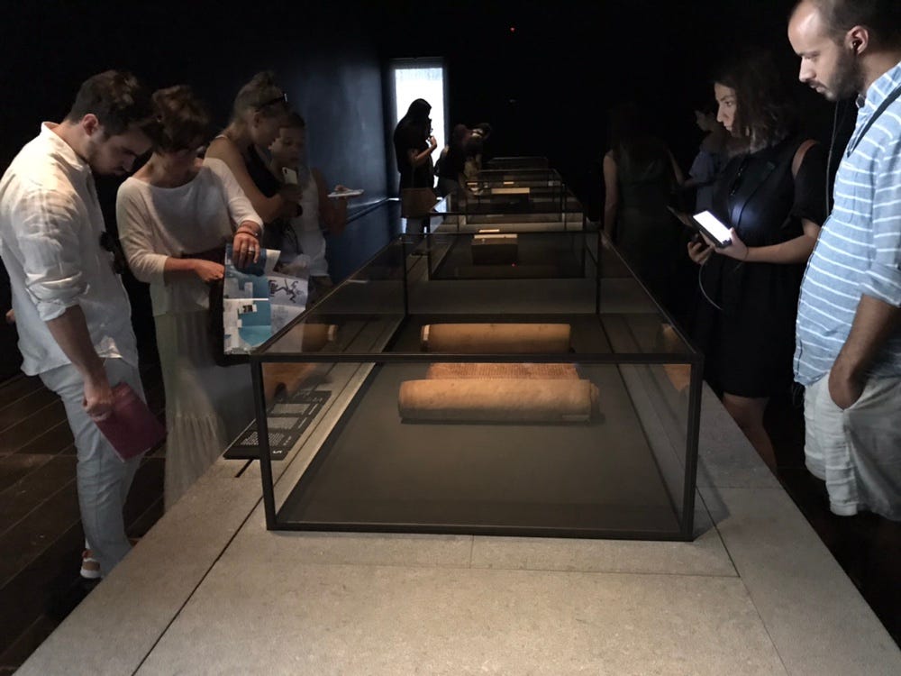
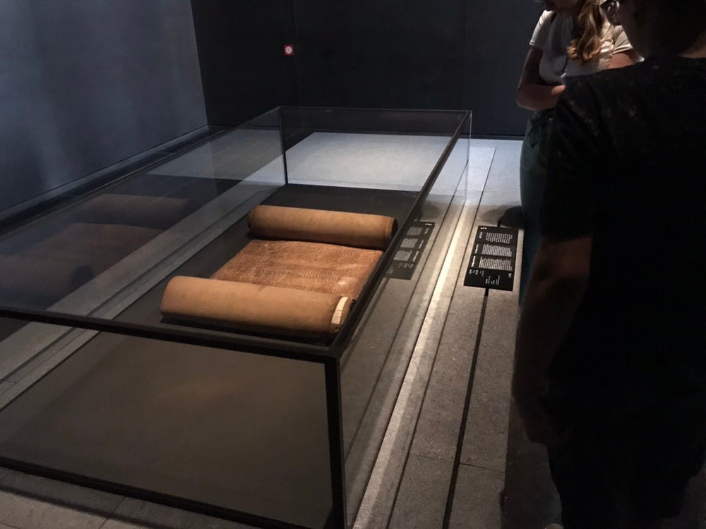
One thing that worked really well was, surprisingly, the 3-digit number codes that you punch into the app to hear an audio tour.
At first I thought “what a shame that they don’t use barcodes that I can just walk up to and scan”. The less work I have to do, the better, right?
But around crowded areas the manual number code worked better. I just had to sneak through enough to get a glimpse of the code, hopefully not forget it by the time I punched it into the app, and off it goes.
The Torah (above) was a popular item and I might’ve given up if I had to wait in line to get close enough to a bar code.
By the way, this room was exhibiting holy books of major world religions. Kudos to the museum for living up to its “universal” philosophy.
More of the wow/confusion mix. The 3D object manipulation was really fun. And more so, I felt like I got to touch and experience the object.
Unfortunately, the UI wasn’t intuitive. Icons were cryptic, and there was even too much UI. Gestures were also confusing. One has to double tap to open a pin on the map, and the now-standard pinch-to-zoom wasn’t supported. Instead a buggy slider was added to the UI, creating needless visual noise.
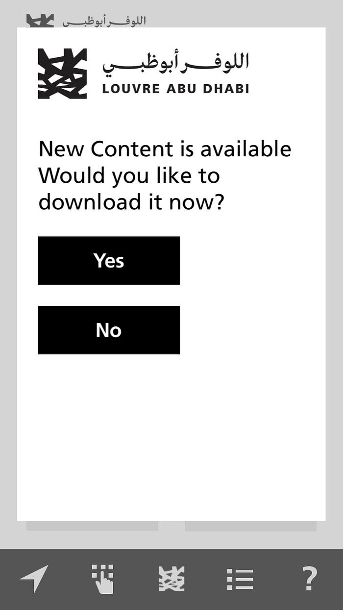
Out of the blue, this popped up. I suppose the CMS was updated and there’s a feature which pushes the updated content to the user. From an organisation-centric standpoint this makes perfect sense.
From a user-centric standpoint it makes no sense. Either update the content silently or don’t prompt the user at all while they’re in the middle of the experience.
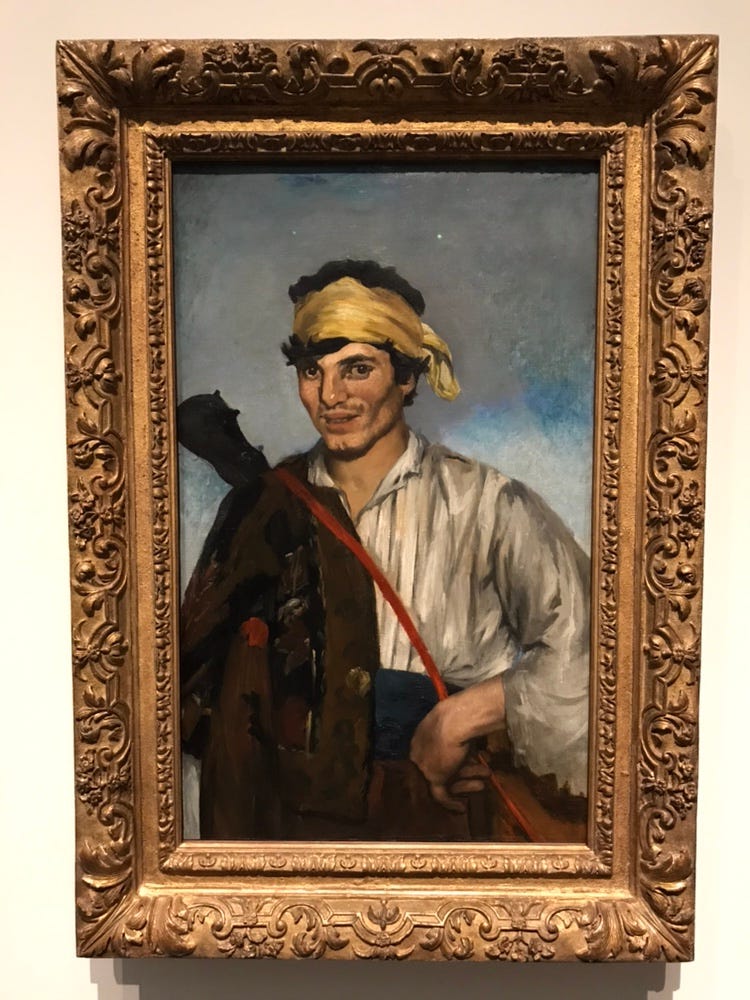
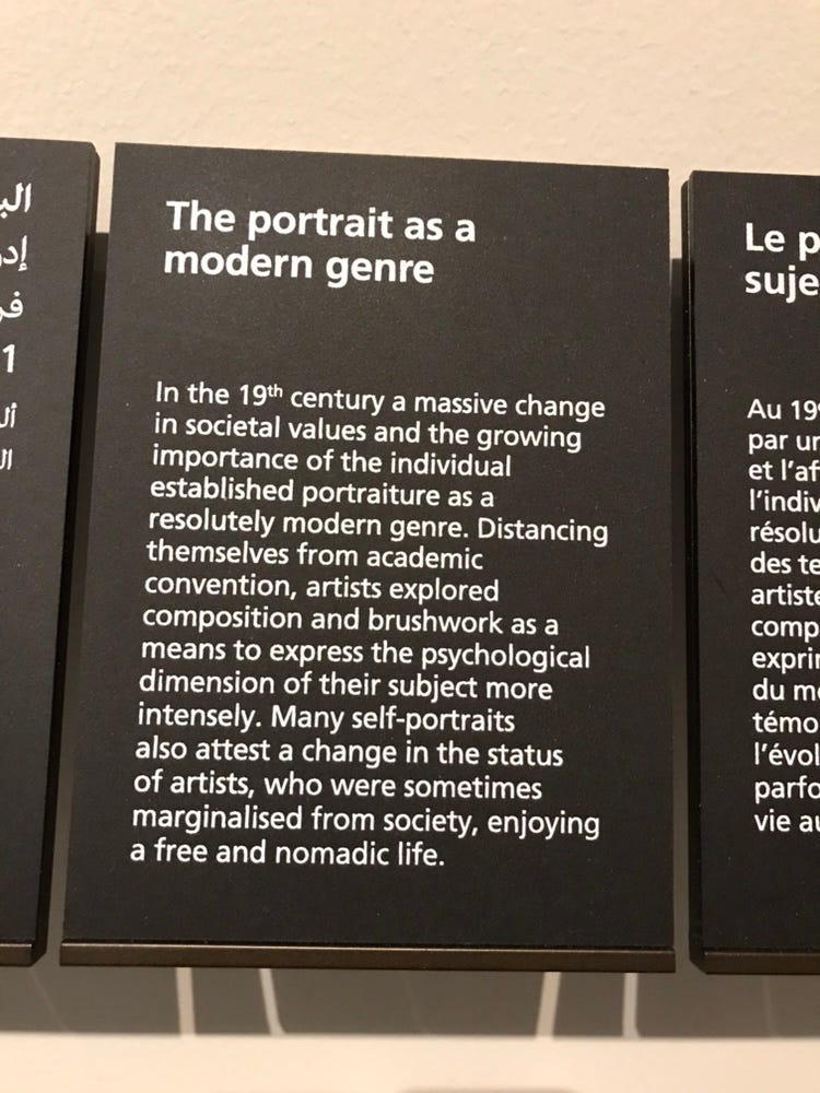
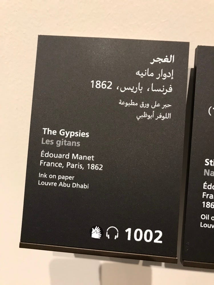
The little placards were spot on. Giving just enough of the right information and never too much.
The content in general was spot on, both printed text, digital text, and audio.
Again, an “Uber for museums” is much needed today. It would let museums focus on what they know best, their content and the stories they want to tell about it.
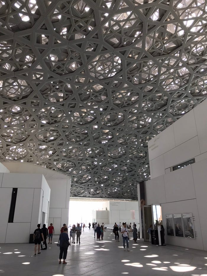
Walking back out into the Abu Dhabi heat, one gets to marvel at the dome structure above the museum and take it all in.
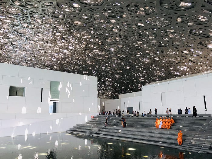
Overall, the museum experience was outstanding. It felt liberating walking around the museum, at my own pace, and not stuck in some big tour group, listening to the audio tour talking about exactly the items that interest me. And because my ears were doing the listening, my eyes were free to fully absorb the object in front of me.
This is undoubtedly the future of museum experiences, and with augmented reality there will come another layer of awesomeness on top of this.
It’s just a question of who will build an app in line with the philosophy of Louvre Abu Dhabi – a universal one.
Follow me if you’d like to read more of my museum “teardowns”. When I’m not critiquing the design decisions of other people, I’m trying my best to make decent ones of my own when designing for the humanities space at Archimedes Digital.
